![]()
測試環境為 CentOS 8 (虛擬機)
Pandas 的資料可以透過 Matplotlib 來繪圖.
下面以 CSV 格式為範例.
[root@localhost ~]# cat pandas_example.csv
,Chinese,English,Math
A1,68,63,65
A2,86,92,89
A3,57,83,77
安裝所需模組
[root@localhost ~]# pip install pandas
[root@localhost ~]# pip install matplotlib
匯入模組
[root@localhost ~]# python3
Python 3.6.8 (default, Sep 10 2021, 09:13:53)
[GCC 8.5.0 20210514 (Red Hat 8.5.0-3)] on linux
Type "help", "copyright", "credits" or "license" for more information.
>>> import pandas as pd
>>> import matplotlib.pyplot as plt
透過 DataFrame 物件將 csv 檔案轉換過來.
>>> df = pd.read_csv('pandas_example.csv' , header=0, index_col=0)

>>> df
    Chinese  English  Math
A1       68       63    65
A2       86       92    89
A3       57       83    77
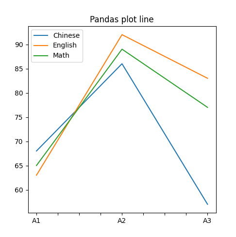
折線圖
>>> df.plot(kind='line', figsize=(5,5), title='Pandas plot line')
<AxesSubplot:title={'center':'Pandas plot line'}>
>>> plt.show()
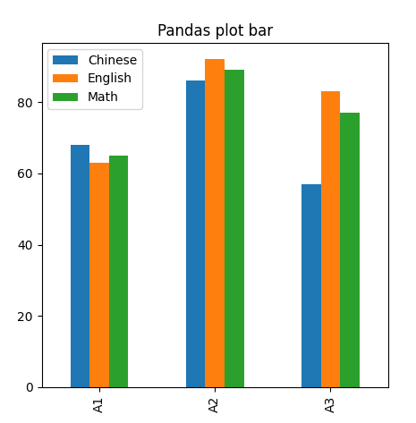
長條圖
>>> df.plot(kind='bar', figsize=(5,5), title='Pandas plot bar')
<AxesSubplot:title={'center':'Pandas plot bar'}>
>>> plt.show()
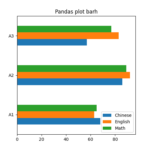
橫條圖
>>> df.plot(kind='barh', figsize=(5,5), title='Pandas plot barh')
<AxesSubplot:title={'center':'Pandas plot barh'}>
>>> plt.show()
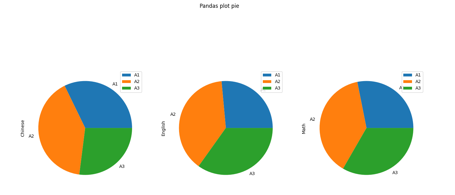
圓餅圖
>>> df.plot(kind='pie', figsize=(16,16), title='Pandas plot pie', subplots=True)
array([<AxesSubplot:ylabel='Chinese'>, <AxesSubplot:ylabel='English'>,
       <AxesSubplot:ylabel='Math'>], dtype=object)
>>> plt.show()
沒有解決問題,試試搜尋本站其他內容